Hi there
Hope you folks all had pleasant weekends. Mine was spent experiencing the sights and sounds of Manchester's vibrant nightlife and looking for kitchens. All very nice...
At the end of last week I announced I had a couple of pieces in an exhibition in the heart of Manchester as part of the cities' week long free arts festival. Well, the exhibition was fantastic. The space was huge and lots of people came and looked around and drank free Peroni.
With the brief for exhibition being based around emerging artists who are working during the socio-economic conditions of the recession I felt I would create some motivational pieces to encourage artists and their practise. The first of these being a doormat entitled 'Welcome Failure'.
 The purpose of this work being that an artist should not be afraid of trying and failing and to a certain extent, 'welcome' it. It's based upon the old as time saying that people learn from their mistakes, and failures. The piece also acts as an actual doormat where people can interact with the art and wipe their feet upon entering the gallery, therefore wiping their feet on failure. Take that!
 The second of my contributions was an acrylic painting on canvas. I titled the piece 'Whole Hearted' as a representation of the effort's of an emerging artist needed to be made and in the interest of furthering themselves; giving their all. There's not really that much too it but I wanted to do something with bold colours that was striking and interesting. The circular canvas also suited the repeating 'tear drop' pattern, adding further depth to the work's aesthetic.
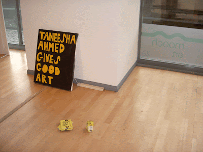
The rest of the exhibition was great, with a really interesting range of artists on display including; Taneesha Ahmed, who had curated the event.
 Lydia Meiying's custom wallpapers and greetings card range

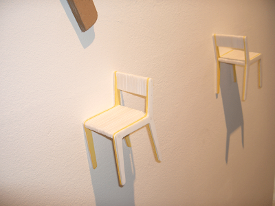
 Gareth Brew
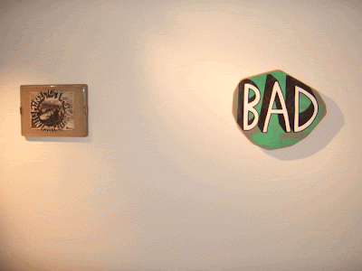
 Sam Venables
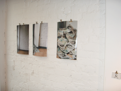
 Alex Moore and Annie Carpenter

 And here is a picture of the stall where various artists had items for sale. The front of the stall was lavishly decorated with literally hundreds of Taneesha's post-it notes. Well done to Sarah (leg's pictured) for putting them up... phew.
 Definitely safe to say that a good time was had by all and hopefully we can do it again soon. So, major thanks to Taneesha Ahmed, for putting it together, inviting me and making everything run like a well-lubricated machine!
And before I sign out, here is a poster for Drever McCusker Woomble's show at the Brudenell Social Club in November, which promises to be a folking good night.
 Over and out.
 It may just be me looking into this a bit much but the similarities are there, though my guy does look a bit more Iron & Wine-esque and is sans book.
 Thanks to everybody who reads this blog, or likes my facebook group, or follows me on twitter, or browses my big cartel store. It all means so much to me. So I hope y'all have a great christmas and incredibly joyous new year!


